top of page

This style guide of Wizard of Oz Magic Match outlines best practices for visual and UX design in the game. From the initial concept to the final polish, we ensure that all aspects of the game create a unique and engaging experience for players.
We understand that each game is unique and requires a visual and UX Style guide. Our goal is to create a visually stunning game with that provides an engaging experience for our players.
Oz's visual style uses painterly aesthetics for the game's characters, visuals, and backgrounds. UI will be designed to simplify the presentation and marry the very realistic characters and backgrounds with more graphical board elements. UI design should pull lighter, more colorful aesthetics of the match 3 category.

General Aesthetics

UX Standards

16px
Aspect Ratio


-
When designing mobile games for portrait aspect ratios, ensure they are compatible not only with 9:16 screens but also with other screen aspect ratios, like 3:4. It is crucial for every component to fit the format and scale appropriately, as intended.
-
Leave space of a minimum of 10px to 20px around the edges as a safe area to avoid overlaps of crucial information at the edges and overlapping with the Apple bar or the notch.
-
A safe area defines the area within a view that isn’t covered by a navigation bar, tab bar, toolbar, or other view a window or scene might provide.

Usability Heatmap
The thumb reachable area is crucial for the usability and player experience of a match 3 game -
-
Comfortable gameplay: The thumb reachable area refers to the portion of the screen that can be comfortably accessed by the player's thumb while holding the device.
-
Ease of interaction: Match 3 games often require players to make quick and precise movements, such as swiping or tapping on tiles or items. If these elements are placed outside the thumb-reachable area, players may struggle to interact with the game effectively.
-
Reduced errors and frustration: If players frequently misclick or make errors due to elements being placed outside the thumb-reachable area, it can lead to frustration and dissatisfaction.
-
Accessibility considerations: Ensuring that the thumb reachable area accommodates players with varying hand sizes is essential for accessibility.

Typography
OZ Magic match uses two typefaces that work together to create a hierarchy between headers, CTA's, labels, numeric values, and body.
Amarante: Chosen for storybook feel, solid shapes, and serifs that hold together on mobile devices.
Example: Headers, CTAs(Buttons), Highlevel Numbers(On progress meter)
Signika: Chosen for universal qualities and clarity at a small scale on mobile devices.
Example: Body Copy, Hints, Descriptions, Numerals(Score), Tooltips etc


Wireframe Presets
Presets for the main game screens provide more clarity in identifying the placements of the major components in the key screens.


Main Map
Basic Buttons Presets

Fonts
-
Minimum font size for button text - 15pt. Preferred font range 15pt<= button text <= 25pt
-
Font used in buttons - Signika (semibold)

Touch targets
Touch target of the Interact-able elements should be minimum of 44*44px

Spacing
-
Minimum spacing between 2 consecutive buttons components - 8px
-
Minimum left and right padding for button - 16px
-
Minimum top and bottom padding for button - 8px
-
Minimum margin around button - 8x
Visual Standards

Colours
-
The core palette consists of gold trims + purple/blue pastels
-
Always service the various hues of green and bright primary colors of Oz
-
These colours are primarily use as dialogs base for most of the primary dialogs in the game ex: Pre level, Post level. This associates with Munchkin land and other Woz elements.
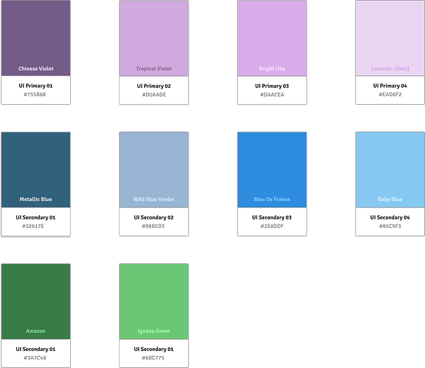
Core Pallette UI


.jpeg)


Basic Button Styles
Inset Icon Style
-
These are the icons set within the border elements.
-
Generally should use flat-colored imagery defined by a contour
Overlaid Icon Style
-
These are the icons set outside/above the border elements.
-
Generally should use full color, shape, and drop shadow to separate them from backing elements but should not use strokes.

Spacing
-
Minimum spacing between 2 consecutive icons components - 8px
-
Minimum left and right padding for button - 8px
-
Minimum top and bottom padding for button - 8px
-
Minimum margin around button - 8x
bottom of page